

Thanksgiving to Valentines Day, 2024-25
Web Designer, Webflow Developer
Bespoke e-commerce website creation
The client sought to elevate their templated, generic site into a fully customized digital experience, featuring a tailored CMS, custom animations, and a responsive e-commerce storefront.
- Discovery & Research
- Information Archetecture
- Visual Exploration
- Content Structuring
- Style Guide
- Final Screens
- CMS Development
- Site Construction
- SEO & Performance Optimizaiton
- Lessons and Reflections
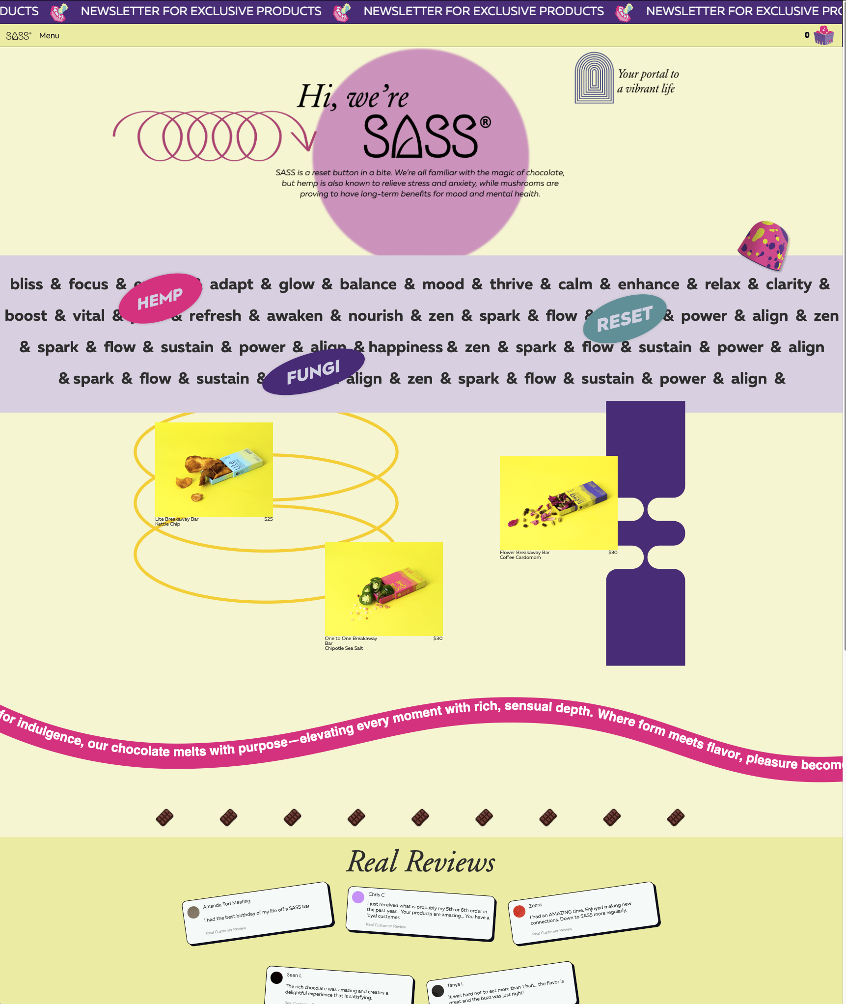
Final Home Screen at sassbk.com
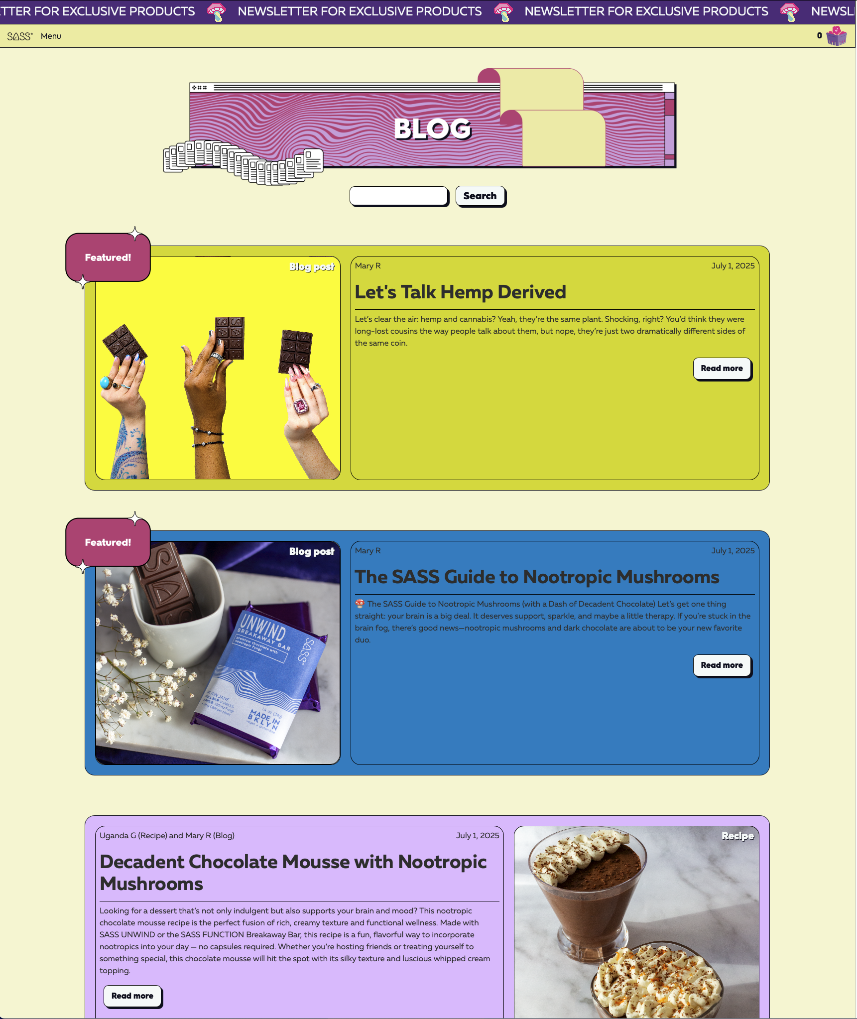
Blog page with custom header

Research into competition and parallel industries online presence
The client began our conversation with visual inspiration that guided my initial discovery phase.
The client was searching for:
1. A playful, luxurious web presence to match the elegance of the product
2. A shopfront that framed the products with custom elements, loading quickly
3. A highly user-friendly backend that copy and marketing staff could amend without technical knowledge
4. Support for blog entries, recipes, events, and inquiries that promote user engagement and SEO placement

Sitemap of the project, with links and available actions
I established a clear information architecture to ensure an intuitive user experience. I mapped out a comprehensive sitemap, organizing content into a logical hierarchy that streamlined navigation and enhanced usability. This process involved structuring product categories, defining key landing pages, and prioritizing user flows to guide customers seamlessly from discovery to checkout. By aligning the sitemap with both business objectives and user expectations, I created a scalable foundation that would support future content expansion while maintaining clarity and ease of use.

4 options of mobile footer design. This key element was used as a inflection point of design language

4 options of navigation bars on mobile, each with a distinct ethos
The client was eager to experiment with visual identity, so I prepared multiple variants of key components to drive the design narritive.
Balancing playfulness with utility, vintage detailing with minimalism, and photography with clarity, I presented the client with multiple visual options.
Based on this meeting, I learned:
The client wants a 90's magazine style, with pastel colors and distinct boundaries between elements.
We decided on a header and footer (options 4 and 4, respectively), and were able to build pages from this decision.
Designing a custom homepage for this luxury chocolate brand required structuring the elements that make up the brand.In order, these elements are:
1. Brand introduction through a striking hero section.
2. Atmospheric storytelling using evocative language and product categories (‘MAGIK,’ etc.).
3. Showcase of bestselling products for immediate visual appeal.
4. Motion and playfulness conveyed through a dynamic text ribbon.
5. Customer testimonials styled to resemble social media engagement.
6. About Us section detailing the brand’s history and values.
7. Custom footer with links to lower-priority pages like TOS and FAQs.

Early pass homepage, with early internet details and Memphis design elements

Laying out the fonts, sizes, colors, and accents of the SASS brand
Refining the lo-fi wireframe into a polished, high-fidelity design involved enhancing visual storytelling, usability, and brand cohesion. I refined typography, color, and layout to balance luxury and playfulness, incorporating custom illustrations, product callouts, and dynamic typography to create a more engaging experience.
Usability is a priority, leading to adjustments in button placement, product displays, and checkout flows for clarity and conversion. Subtle animations, improved contrast, and structured hierarchy ensured a seamless blend of e-commerce functionality and brand storytelling, resulting in a site that feels both intuitive and premium.


Final mobile screens - home, shop, and item templates

A look at the final CMS backend, with placeholder items
I developed a custom CMS to give the client full control over their website’s content, including products, categories, blog entries, and events. The CMS allows seamless management of the e-commerce catalog, with fields for product variations, pricing, and featured labels, ensuring a dynamic and scalable storefront. Additionally, I built custom blog and event entry forms, enabling the brand to publish updates, promotions, and announcements without needing technical expertise.

Fully developed home page, with adaptive design, custom graphic elements, and CMS
I translated my high-fidelity Figma mockups into a fully responsive Webflow site, ensuring precise alignment with the original design vision. Using HTML and CSS knowledge of best practices, I built an adaptive layout that maintains consistency across all screen sizes. Custom graphic elements and animations were integrated to enhance user engagement, while global styles ensured a cohesive look throughout the site.
To support scalability, I implemented Webflow’s CMS, making dynamic content like blog posts and project galleries easy to update. Accessibility and SEO best practices were incorporated, optimizing performance with lazy loading and compressed assets. The final site is polished, interactive, and fully responsive, staying true to the original Figma design while ensuring a seamless user experience.

Blog page, with featured badge, search, author, date and more
I optimized the site for speed and search visibility by setting strict image size standards, ensuring all uploads use the minimum viable file size without sacrificing quality. Where possible, I replaced raster images with vector files, maintaining crisp visuals while reducing load times. Thoughtful use of color and whitespace allowed for a full, engaging design without relying on heavy elements, improving both aesthetics and performance.
To boost engagement and SEO, I structured blog and recipe posts with relevant keywords and metadata, creating dynamic content that drives traffic. Webflow’s clean code and semantic HTML further enhanced search rankings, while optimizations like lazy loading and asset compression kept the site running smoothly across all devices. The result is a visually compelling site that loads quickly and ranks effectively.

Age gate popup to bar minors from accessing the storefront. Note the 90's magazine homage, with inspiration from Teen Vogue.
This project taught me the value of balancing creative risks with solid design principles. I learned to push visual boundaries while ensuring the design remained functional and user-friendly. Structuring files meticulously became essential, knowing I was building a foundation that future developers could easily navigate and expand upon.
I also discovered the importance of problem-solving through the design’s intent rather than rigidly adhering to the mockups. Flexibility in development allowed for better solutions without compromising the original vision. Lastly, I realized that having clear direction and alignment from the start is key to smooth, efficient development, minimizing revisions and keeping the project on track.


