

3 weeks, December 2021
Interviewer, UX, UI designer
Provided prompt to hi-fi prototype
Our fictional client has code for an AI content generator, and needs UX to make it flow, UI to make it intuitive, and a key feature to address users' pain points.
Interview content creators.
Identify pain points in workflow, both traditional and AI assisted.
Ideate on a feature to address a user issue.
Converge on a UI style.
Create a user flow.
Build user flow, test, and deliver a minimum viable product.

The original site
I started, of course, with people. My first interview, a college journalist for a local paper, opened up a lot of interesting discoveries. He was writing a lot of content, but hasn’t been able to do in-person interviews in the past year - and found himself losing focus of his audience. Interesting.
After conducting further interviews, I set about addressing their needs with two divergent, but necessary personas. With these writers in mind, I formulated a set of problem statements. I finally sorted those problem statements in a MoSCoW chart - I was converging on my solution. My research was telling me that a content generator must create an outline of any type of written content, and it must keep the writer engaged with their audience.

Danny persona - IT expert who writes weekly reports

Amelia persona - prestige writer at local newspaper
I set about ideating how to translate these needs to paper. I started sketching out the Must Have of my approach section, how to keep the audience front and center in the creation process. I began the design process of drafting problem statements from my personas.
Two of these stood out: the need for one's needs to be integrated from the start, and the need to not lose focus on the target audience with all the automation happening.
I got back to sketching and two exciting, core ideas developed: a simple questionnaire and a dynamic persona that evolved as you entered information.

I needed simple yet pertinent questions, as few as possible, to feed relevant information to the AI while keeping the user engaged.
In re-coding my interviews, I discovered users needed at least three establishing facts to begin a great piece: Who, What, and How. Perfect! A user flow was beginning to spring up - I worked backwards and forwards from these simple questions.
I translated these questions into my core Audience, Topic, and Tone, and tested the order. A bit like ‘mac and cheese’, the word order just felt right! Now, let’s get them on screen.

After the first question, ‘Audience’, is answered, a box shows up. An AI generated portrait, name, occupation, and a set of likes / dislikes is populated. This is the persona.
As audience gets refined further, or as topic and tone get filled in, the persona adapts. The topic of new Sony headphones might turn, for example, Dan the plumber into Jess the jogger. A serious tone might again adapt Jess into a paralegal who loves to jog, but hates her loud commute on a public bus. Don’t like that Jess doesn’t like loud dogs? Just click on her dislikes and wow, now she’s an antiquer who hates driving and loves indoor gardens! Just like a designer persona, Jess isn’t the perfect reader - but she’s a perfect frame of reference, and a distinguishing feature that presents a new edge to our content creation.

I have two things users want (a questionnaire and a persona), and the three things to ask the user (audience, topic, and tone). I then sketched out my ideas.

I got this screen in front of some collegues who were familiar with the assignment. I was pushed to re-evaluate my idea of the split screen, and to consider guiding the user more. After this productive peer-feedback session, I drafted a mid-fidelity of the onboarding process.

We have our structured on-boarding and we have a rich persona.
Using my user flow, I introduce the elements one click at a time - turning the entire screen into breadcrumbs. Audience -> topic -> tone -> content.
In this hi-fi stage, I was able to leverage my choice of color strategically. Blue is the stability and trust of our AI with your content.
All branching decisions you make are in blue.
Green is the evolving, playful nature of the AI. The green bubbles let you know the AI is present, thinking, working.
Decisions made by the AI are in green.
Questions are blue, and in the corner of the screen are green shifting, playful bubbles. This green is the AI thinking with you, evolving and learning as you refine your content.

Audience to topic to tone to... content. What is that content going to look like? I had a rough outline, but to refine I needed to think creatively.
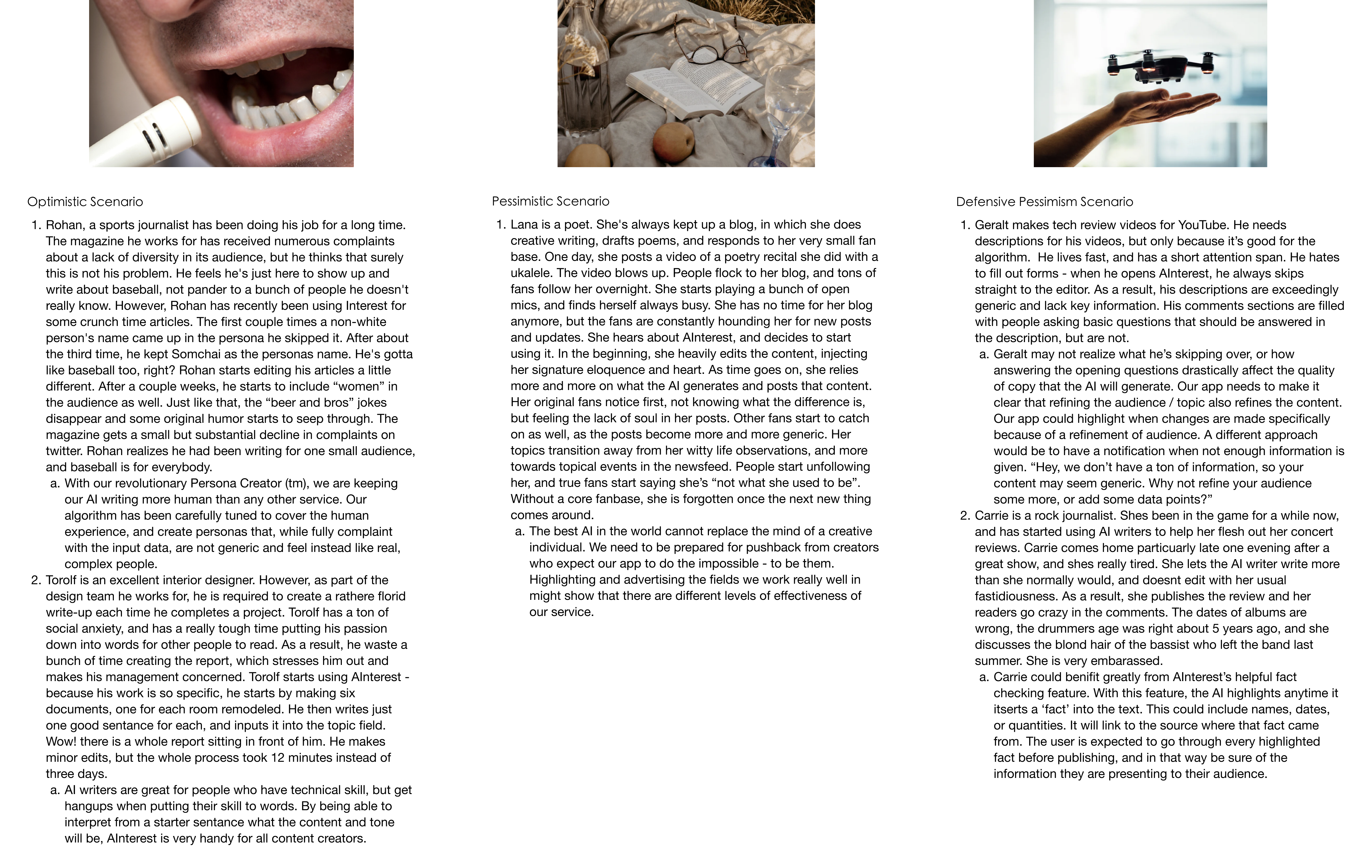
I started writing Speculative Fiction Scenarios. To ideate on what needs a user could want with, I wanted to focus on three things: optimistic scenarios of created content, pessimistic failure cases, and scenarios of actionable defensive pessimism.
I learned three things:
I then addressed these issues in my content creation screen:
I updated the screen with my meaningful color choices discussed prior- Green surrounds the persona and the content created, indicating these are AI generated. Blue envelops the onboarding choices on the left, as well as the infinite undo/ redo- these are the choices of the user.

My final step was to prototype the screens. I attached everything and let a user click through it - their immediate feedback pushed me to add a "skip" button.
I gave a primitive animation to the green bubbles - in a next step of polish, I would love for the bubbles to slowly move and speed up as the user is inputting data: a velocity given to the AI's mind.
Finally, I took a cue from my editor page, and signified that the content of the persona was editable using underlines. This is accompanied by a small text box explaining the intent of the underline. The next step would be to test the effectiveness of this, and if users feel comfortable swapping content.
Lessons Learned
I learned that a solid user flow is key to keeping a complex project on track. I also learned that not every user will follow your flow - that’s okay! Building an experience while also allowing the user to take a different route is not humbling, but instead a welcome challenge in versatility.
I also learned to read interviews with an open mind. It is a challenge to not start designing as soon as a prompt is provided, but the goal is not to exercise one’s mind - the goal is to make people’s lives better.


